Saturday 25 May 2013

Sketchbook Work

This is a sketch I started some weeks ago in pencil, which I decided to finish in pen and wash.  It's only partially finished, but I quite like it that way.  Although blue wasn't in my colour palette, from the photograph, there was a hint of blue, which I've emphasised and I feel compliments the other colours.
I like this little sketch which I've done in black and grey pens.  I need to darken the right hand side a bit as it is in shadow, but don't want to over work it.


Below is an unfinished sketch.  It is an abstract taken from part of a photo-montage I created a number of weeks ago.  It's from a photograph I took in Castlefield.  That's all for now, but I'll be uploading some more sketchbook work soon.  this must be the shortest post I've done.

Monday 20 May 2013

Final Stages of Industrial Evolution Canvas

I took this image to show how the wash of paynes grey has toned down the yellow ochre, which I applied on 19th May and left over night to dry.  It has added depth and tonal value to the image.  I felt the burnt sienna and red ochre looked a little flat against the yellow ochre so I added a little paynes grey to some vermillion red, which I painted it on as a wash over the red ochre.  This colour reminded me of the red Victorian brickwork, so I feel its a good decision.


The vermillion mix has certainly warmed up the overall effect.  I like the contrast from the middle section and the outer edges, which is what I wanted to achieve.  This is close to how I imaged it would look like colour wise.
I spent some time aging the photographs further by using a fine sandpaper.. It hardly takes any pressure to remove parts of the image.  I then added both red and yellow ochre wash to the scratched parts of the images to blend them further into the background making them look part of the overall effect.

View of the top right hand corner.  I'm loving the contrast between light and dark (chiaroscuro).  I still felt the reds looked a little flat and I decided to add some antique gold acrylic with a palette knife and apply it to the creases and folds in the red ochre/vermillion area only and I feel it's had the desired effect, as it highlights the texture.  I've added some more detail with a black fine tipped pen to emphasise the blending of the stamp and photograph images.  I quite like the effect.


Top left hand side.  It is just possible to see the gold on the red.  I have tried to keep the gold to a minimum, which is evident in this image.  For a change I thought I'd go for a subtle effect.

I am pleased with how this canvas has worked out.  I have thoroughly enjoyed working on it, getting back to what I enjoy most; being creative.  Even though the canvas is large, once I'd started to work on it, it didn't feel that big.


Framed photos and image transfers all ready to go to Castlefield Gallery.  Good old bubble wrap!!  I'm looking forward to seeing my framed photographs up on the wall, as I only saw them briefly before they were wrapped up for transit between the framers and the studio (StudioFour Gallery) and then on to Manchester.


Main canvas all ready to go too.  I can't wait to see where in the gallery it's going and taking photos.

Sunday 19 May 2013

Industrial Evolution canvas almost finished

Image transfers now ready to be revealed.  It's going to be a long day as I know there is still alot to do.
I have applied water with a sponge and it is just possible to see the image beneath.  When wet the stamp image looks quite clear, but as it dries it is evident that more water and elbow grease is needed to rub the remaining paper off.


Below image. I'm not liking the milky white glue residue and I have tried to lift it gently with one of my nails, but it now looks worse.  This is going to cause me trouble I know it is.  I decided to leave it for a bit to see if it looks better once dry.
I like this one.  The arches work well with the railings of the bridge in the photograph.  I also like the colour behind the image transfers too, although I may need to alter it slightly, as in add more.

Opposite.  Just checking the colour balance for the umpteenth time.  It helps to stand back from your work, so that you can appraise it from further away; this way you can see
Below.  I love this, although the photos doesn't do it justice as there seems to be a lot of reflective light, but it does show the variety of textures.  I've been working on darkening the arches with diluted paynes grey, which does show up all the crevices between the egg shells.

Opposite.  This is a view from another corner.  There is still work to be done as I'm not yet satisfied with the yellow ochre.  Although I love bright colours, it is too bright.
Opposite.  And yes you've guessed another corner shot.  I have used burnt sienna because I love how it granulates and this has bled in to parts of the yellow ochre, although this isn't the best image to see that.
I was stood on a chair for this shot.  It's getting there, but slowly as I have to wait for each layer of paint to dry.


It was suggested to me to use a piece of sandpaper on the edges of the images, so that the edges were less obvious.  I've never used it on photos before and I have to say I was a bit nervous.  I'm not entirely about it and have spent a bit of time wondering if I've made a mistake.  I realise it has aged the image further and I'm not sure about how much to use it on the other photos.  I'm worried I'll ruin the image altogether. 


On this image left it does look affective as I've also used the fine sandpaper to rub over some of the textured areas I've created and I'm very pleased with the result.
Opposite.  Further evidence of the rubbed surface although softer here as the texture required more gentle rubbing.


Below  I've added a very diluted layer of paynes grey to both the sides, top and bottom.  Initially I was only going to do the yellow, but changed my mind and decided to wash all the paint because I think it will create depth to all the colours I've used.

Another view of the variety of textures, colours and tones.  the areas I've used the sandpaper on show up well on this image too.

Saturday 18 May 2013

Painting underway!!!!!!


A practice run with the images to make sure the spacing is correct.  Hopefully I have achieved as close a Golden Ratio, as I have spent weeks working out various measurements. It's hard to tell how the overall effect is going to look not being able to see the stamp images properly.


It has taken me ages deciding how far from the edge of the middle section I wanted the images to sit.  Here are the first two of seven images glued into place.  No turning back now.  Now that the canvas is upright you can see the textured tissue paper.


A close up. The colour looks a bit pale here, but is deeper in reality.  I'm excited to see how the tissue is going to look once the washes have been added.


Well on the way now.  I have to say that either I'm getting a bit pedantic over the measurements or I'm just crap at it, because it took the best part of a whole afternoon getting it right.  I kept having to check it and mark lightly with a charcoal pencil where I wanted the images to sit.  I used charcoal because I knew it would wipe away and leave no marks.


I'm liking what I've done so far, but I think I may need to blend some of the colour to the edges of the photos because I'm not sure about the clean straight edges of the images.  I know that the stamp edges will blend quite well.  All the textures are showing on this image.


Almost there!  I can't wait to start painting the outer edges.


Close up.  I think the photos look good against the texture and colour.  I feel that the photographs are complimented by the background texture and colour, although the yellow ochre may need toning down a little.


All the images on now.  Just waiting for the image transfers to dry so I can rub the backing paper off.  That's a job for tomorrow. 


Close up. Although the white paper looks like it is slightly raised it is stuck securely to the surface of the canvas.


At last, some more painting.  I lifted the canvas up in various directions so that the acrylic paints (yellow and red ochre and burnt sienna) bled into one another to create a more realistic effect.


I like the colours on this image, but I know I'll need to knock back the brightness of the yellow ochre so that it looks less garish.


I realised that after looking at this image I needed to add some red ochre to the top of the textured tissue paper, so that the colours flowed better.  The red ochre adds warmth to the canvas.  I will be adding a paynes grey wash to the corners at the top edges of the arches to cool the edges slightly, which should add a little more depth.


It's starting to take shape by this stage.


Above is a close up of the right hand side of the canvas. 


Final section covered.  I will need to wait until it's dry to assess how much work I need to do to finish the surface.  I've not been able to stand the canvas up yet as the paint is still quite wet.


Looking at this image I realise I will have to add a wash of paynes grey or red ochre to knock the brightness of the yellow ochre.


One of the things I wanted to achieve was to emphasise the edges and I think I've succeeded.  I may add some more definition subtly.


Looking up the canvas as it was drying.


Above is a close up showing the textures and definitions of the edges I spoke about on the previous photo.

Opposite is a slightly larger view.  I think the egg shell looks good with a few more layers of red ochre.


View from the bottom left hand side of the canvas.  It's strange how different the colours can look from a different angle.  This corner looks darker than the previous two images, but in reality it's not.


Top left hand corner close up.  I have decided to keep the outer corners very light to add to the colour contrasts.  This is a form of chiaroscuro that artists such as Turner, Rembrandt and Caravaggio used to great effect.


I have called this image Reawakening, because Castlefield was once the hub of Manchester's Industrial economy and with the rejuvenation of the area into a bustling place, I thought it was an apt name.  One of my successful stamp image transfers.  Unfortunately I didn't have the same success with my photograph image transfers and I've had to make changes to rectify this development.  I had had the images printed on 160gsm paper using a different printer than I normally use, but when it came to rubbing the backing paper off, the image was coming off too.  I've had to use images on printer paper from an inkjet printer.  Let's hope they work this time.
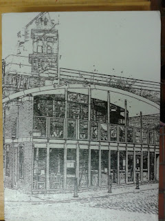


I chose to name this one Revival.  It is built into one of the railway arches, reviving a space that had become redundant.  This too is a success.  First I flipped the image on Photoshop so that it would face the right way.  I applied gel medium to the image and placed it face down onto the canvas.  I burnished the images with a tissue to make sure all the image was completely flat and secure.


This stamp image is called Renewal, because the area that the church overlooks has been renewed.  The old mills in Castlefield have been turned into luxury apartments or offices.  Parts of the surrounding area in Castlefield look fresh and new, yet they don't look out of place with the Victorian buildings and other feature from that period.