Tuesday, 5 February 2013

Further and Final Cyclamen Development

 Close up of upper part of left hand-side of the canvas.  It shows some pale washes to emphasis shadows and that white is almost always not pure white; white picks up hues from other colours around it.  I wanted to keep most of the petals simple in colour to reflect the genus of Cyclamen  had taken a photograph of.  i also think this image could make another unusual composition that I could use in my sketchbook.
 A slightly different angle from the one above this image.  I have started to paint the spots with a Cochineal a pinky/red acrylic paint.  Under the that I've used a pale wash of Primary Magenta for the spots and I also used a baby wipe around the edges of the spots to soften the edges.  I used a wash of Primary Magenta and Paynes Grey for the subtle shading and marks on the petals. 


 A slightly better view of the shading on the upper petals on the one above and below.
 I think the image below looks quite fierce in the intensity of colour and brush strokes.  I have found it quite difficult to blend the brush strokes so that they look more natural from the top of the petals, but I feel I've almost got it.  The only thing I'm not too sure about is that the top of this petal on the photograph is dark like I've done here, but the part underneath is too red, whereas on the photo it looks pinky.  I may change this before deciding it's finished.
 I feel the image below would also make a good composition in its own right.
 Almost there and I have to say I'm pleased with the result.  I like the softness and fairly regular shapes of the petals against the random marks of the foliage.  I feel it works well as a contrast and the colours I've chosen to use also add to the the overall effect.

 I'm not sure about the image above as to whether it would make a good enough composition, but I find it interesting to look at.  I have added more red Cochineal to some of the spots mixed with Gloss Gel Medium to help the paint move around more easily.  It also adds a sheen to them making the spots stand out more.
 I like this image of the strong contrast of the top of the petal against the spots.  My primary aim was to highlight the delicacy of the petals against the background.
The petals look huge and dominate all of this image set off by the narrow background running to the right hand side.
 The image above should have been rotated before uploading, but it nonetheless looks effective.
 I took this image across the right hand side to show that the painting goes round the edges of the box camera.  The canvas although taken at an unusual angle wouldn't look out of place this way up, which I find a little odd, but it has given me food for thought.
 This is the other side of the canvas showing how I've extended the detail onto the sides.
 The image above is almost identical to one above, but shows a slightly different composition.  Strong lower petals against a strong background and softer upper petals.
Virtually done.  I have added more Primary Magenta again as I wasn't satisfied with the bottom top petal.  I'm not sure yet but i may knock it back a little with a watery white wash.  I will decide tomorrow morning before taking the finished piece to show my client.  Let's hope he likes it.

Sunday, 3 February 2013

Further Work On My Commision Piece Cyclamen

 A close up of one of the petals.  I have used a very pale wash of Crimson Red on certain areas of the petal but left a lot white.  I chose this particular composition because I like painting unusual shots of the flowers I see and also because I thought this genus of Cyclamen looks especially delicate. 
 This is a close up of the bottom center of the painting showing various stages of development.  On the photograph I took the background foliage is out of focus, but I felt that the colour range was bland, so I have used various shades of green of different strengths to enhance the delicacy of the flower.
 A close up of the tops of the lower petals.  It is possible to see the faint colour tapering down that gives the petal a sense of shape and movement.  I shall be adding more colour to the top right petal and tapering it down until it's almost imperceptible.

 Although I added this images in the order I took them for some reason they have been uploaded out of sync.  The image above shows where I've applied large pools of Phthalo Green and Light Green.  I kept looking at it on an off for quite a while undecided whether I liked it or not.  In the end I wiped it all off and decided to just add some more darker shades of green using Paynes Grey to add depth.  I will be adding them a bit at a time so that I can manipulate the paint better.
This image should've have been the first image following yesterday's post.  I can start to see how strong the contrast is between the delicate petals and the background.


 Here is where I've added more colour to the petal on the right side graduating the intensity to create the delicate colour.  It isn't finished yet as the colour is deeper towards the edge.  I have also started to deepen the spots on the rest of the flower, leaving the edges fuzzy so that it looks more realistic.
'
Last one of the day and I'm quite pleased with the result I've achieved so far.  Hope my client is pleased with it too.

Saturday, 2 February 2013

Commission Work Abstract Cyclamen

 First wash of acrylic painting for my Commission work.  I had made a light rough sketch I used Phthalo Green to the background after I had applied clean water to the canvas. I used a large brush to apply the water and the paint so that i could achieve a fairly even tone.
Here I've added a light green for a contrast to the still damp Phthalo and then lifted the canvas up at various angle so that the colours blended into one another.  I wanted to achieve a similar effect that i had with the batiks I've done,which to some degree has worked, but due to the rigidity of the canvas it doesn't soak into it as well as fabric canvas that hasn't been treated with gesso or white acrylic. It's still looking pretty pale.
 Below I have mixed a wash of Crimson Red to the background petals of a Cyclamen.  I have let it bleed into the Phthalo Green.  It has been quite hard keeping the white areas clean, but thank goodness to baby wipes.
 I had added a stronger mix of the greens, but didn't like the effect as I'd forgotten to lay down a layer of water first, so I wiped it of with kitchen paper and re-applied it again for a smoother look.

 Before I had lifted the canvas and moved the direction of the paint so that it bled into one another in the above shot and below you can see how the colours have merged.
 On the image below I have added pools of colour and again tipped the canvas.  I then used a hairdryer to dry the paint and achieved some interesting tones and shades of varying depths.  It looks like indistinct foliage, which is what I wanted to do.  I have found it quite tricky doing this technique on a large area, without it running into the white areas, so I started to do it in smaller sections.
 The right hand side of this image still needs work on it to try to create the same effect as the left side.


 It helps to put my work up on an easel and stand back from it so I can see how it is coming on and to also check for areas that needs more working on.  I need to add some washes of Paynes Grey to knock back some of the brightness and to darken parts of the background too, especially towards the right hand corner and towards the large petals in the foreground.
 Here i have started to added the spots and red/pink markings on the petals.  I used the same Crimson Red, but in a paler tone, as some of them will not be much darker on the finished piece.  On the light purple petal I mixed a little Crimson Red with a little bit of Blue and started to lay down the wash.


 This is a close up of the center of the canvas.  I like the effect of the foliage against the delicate contrast of the petals and this i hope will make the flower stand out.
At this stage I have sopped to let the paint dry naturally over night.  Stay posted to see further developments.

Tuesday, 29 January 2013

Sketchbook Work

This is one of a few Batik works I've done from compositions of photographs that I've taken.  I have faintly sketched the image I wanted on to silk.  I then added hot wax to the areas I wanted to keep white.  This drys quite quickly.  I selected a limited palette of red, pink


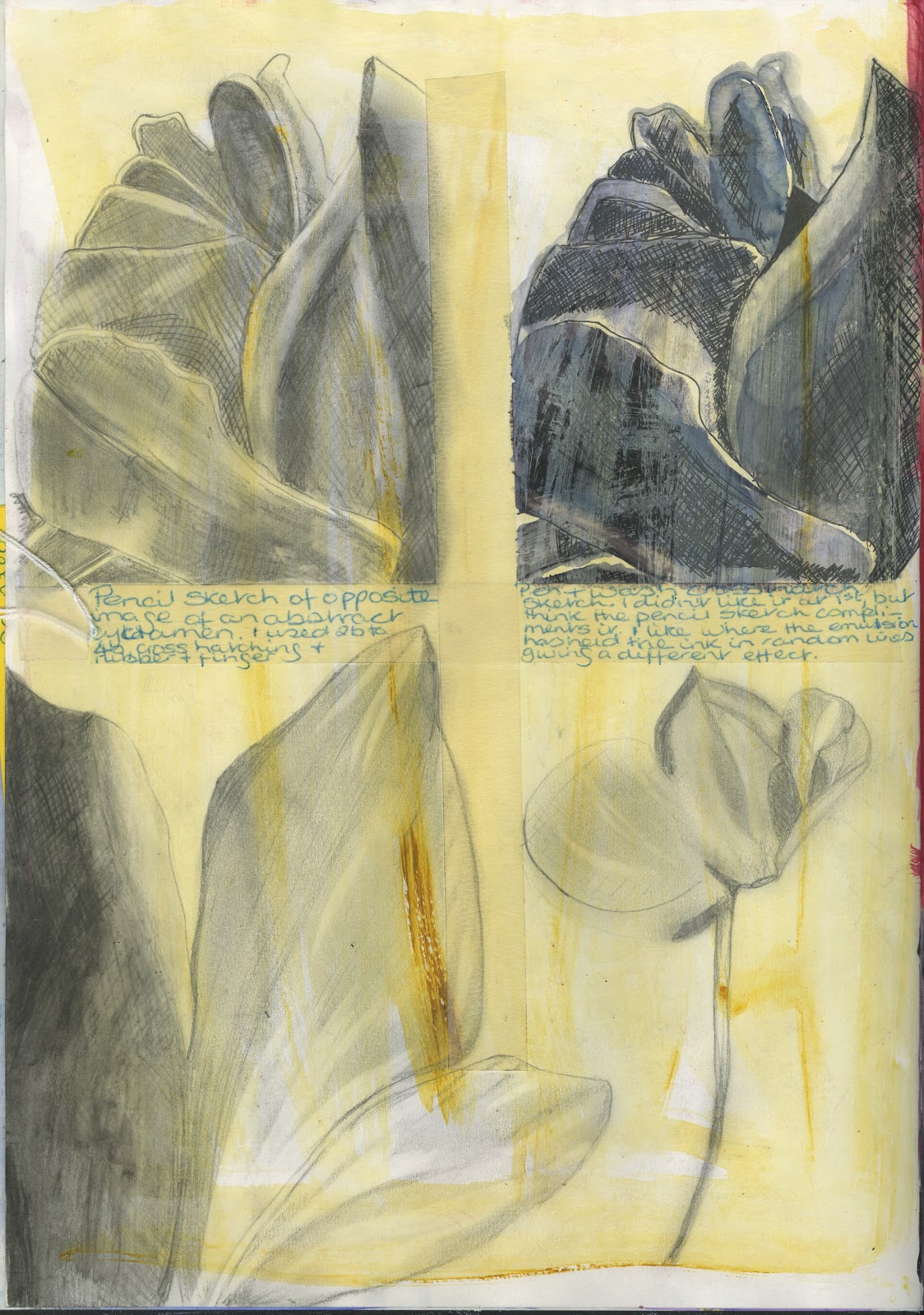
This and the two images below were all manipulated in Photoshop using the inverted tool in images.  I've also used hue/saturation tool too to alter the colour combinations.  I love how an image can look different just by changing the colours.  I think in this case it has worked best on the two abstract images of a Cyclamen as it compliments the compositions.


Recycled art work for Greeting Cards

These two images are prints I created last year as part of a project I did after a field trip to Barcelona January 2012.  It was inspired by Antoni Gaudi a Barcelonian architectand famous for his as yet Sagrada Familia and Ernst Hundertvasser and Austrian artist and architect.  the were both inspired and influenced by nature, particularly spirals and the undulating movement of the ocean.  
On the 28th January 2013 StudioFour Gallery, which I share with  Louise Knight, Carol Newton and Michelle Stringer had our own stall on Macclesfield's Treacle Market.  We have all been very busy with finishing deadlines for our Foundation Degree Creative Arts for Employment course and we were panicing a bit about whether we would have enough small sellable work to out on the stall.  I used these two images to create some greetings cards.  I cut them up into squares and rectangles in varying sizes and stuck them to prpeared card, with envelopes.  I had also created some textured back grounds, using tissue paper and water colour paints, which when dried I used in the same way as stated above.  These have created some lively cards that I hope will sell.  I enjoyed doing practicle work after so much writing for my course.  It reminded me why I enjoy being a mixed media artist. 
 
I will be posting some of my cards soon and sections of the background I created.  So watch this space.


Tuesday, 15 January 2013

Clay Postcard Project Final Product

 Here we have the end product of my clay postcard.  I'm really pleased with how this piece of work has turned out.  I like the way the colours have turned out after it had been glaze fired and I feel that this piece reflects each individual artists' work, texture and colour, which was the original intention.
 This is a close up of Louise's section.   I feel that the various applications of body stains have allowed the illusion of depth in this scene.  I have used a clay knife which is very thin and fairly sharp to show the buildings and a plaster mould for the sun.  
 A close up of Michelle's part showing the different textures I've applied.  Texture is important to Michelle's work and I wanted to reflect this on this postcard.  I have used a variety of tools with which to impress the various textures from earrings to netting.
 I enjoyed creating Carol's part trying to think of ways to express her textile artwork.  I have tried to emulate French knots,  hearts,buttons and patterns in relief and imprinted into the clay.  Hearts are a re-occurring theme in her work and the lines on the edges reflect her stitch  work.
 This is my section and I'm not as pleased with it as I am with the other parts of the piece as I had to rush it due to the session finishing  and I wanted to have it bisque fired for the following week.  Although it shows aspects of my work such as a flower and a partial landscape scene the lettering isn't as good as the others on this postcard.
I like the texture on the center of my postcard and by rubbing some of the black body stain off before applying the transparent glaze has helped to add depth to the background.  I could've spent a bit longer cleaning up the lettering to make the words stand out more.
In this image I have scanned the postcard onto an Apple Mac and then using Photoshop I have altered the hue and vibrance, which has given a purple/blue/ yellow/green/pink hue.  I quite like the colours, but I would probably tone down the intensity so that the colour doesn't detract from the textures, scenes and patterns.